Clarity Growth Co
Scroll-driven editorial website for busy founders seeking work-life balance
Client
Clarity Growth Co
Role
Motion Design, UI/UX, Front-End Development
Live
Visit siteBuilt with (for the curious)
React + Vite, GSAP ScrollTrigger, Custom animations +1 more
Summary
Built a scroll-driven website with GSAP pinned sections, tactile paper textures, and friendly flat illustrations. The design feels like a curated workbook—airy, editorial, and calm—matching Clarity's promise of sustainable business growth without burnout.
The Challenge
Clarity Growth Co needed a website that embodied their brand promise: helping busy founders build businesses that fit their lives. Generic coaching sites felt too corporate or too 'hustle culture'—they wanted something calm, editorial, and intentionally designed.
The Solution
Designed an airy, scroll-driven website that feels like a curated workbook. Each section pins in place with smooth GSAP animations, using tactile paper textures, hand-drawn circle markers, and friendly flat illustrations. The experience is calm and intentional, matching the brand's promise of sustainable growth.
Project Snapshot
Goals
- Embody the brand promise of calm, sustainable growth
- Create a unique scroll-driven interactive experience
- Feel editorial and tactile, like a designed workbook
- Drive quiz completions and discovery call bookings
Constraints / Requirements
- Warm paper textures with limited color palette (cream, navy, sky blue)
- GSAP ScrollTrigger for pinned section animations
- Performance-optimized despite rich animations
- Mobile-responsive with reduced motion fallbacks
Deliverables & Rationale
What I Delivered
- 7 pinned scroll sections with 3-phase animation (entrance/settle/exit)
- Hero with auto-play entrance animation and illustrated workspace
- Problem/solution section establishing the brand narrative
- Social proof section with specific outcome metrics
- Signature offers card with 'sticky note' design treatment
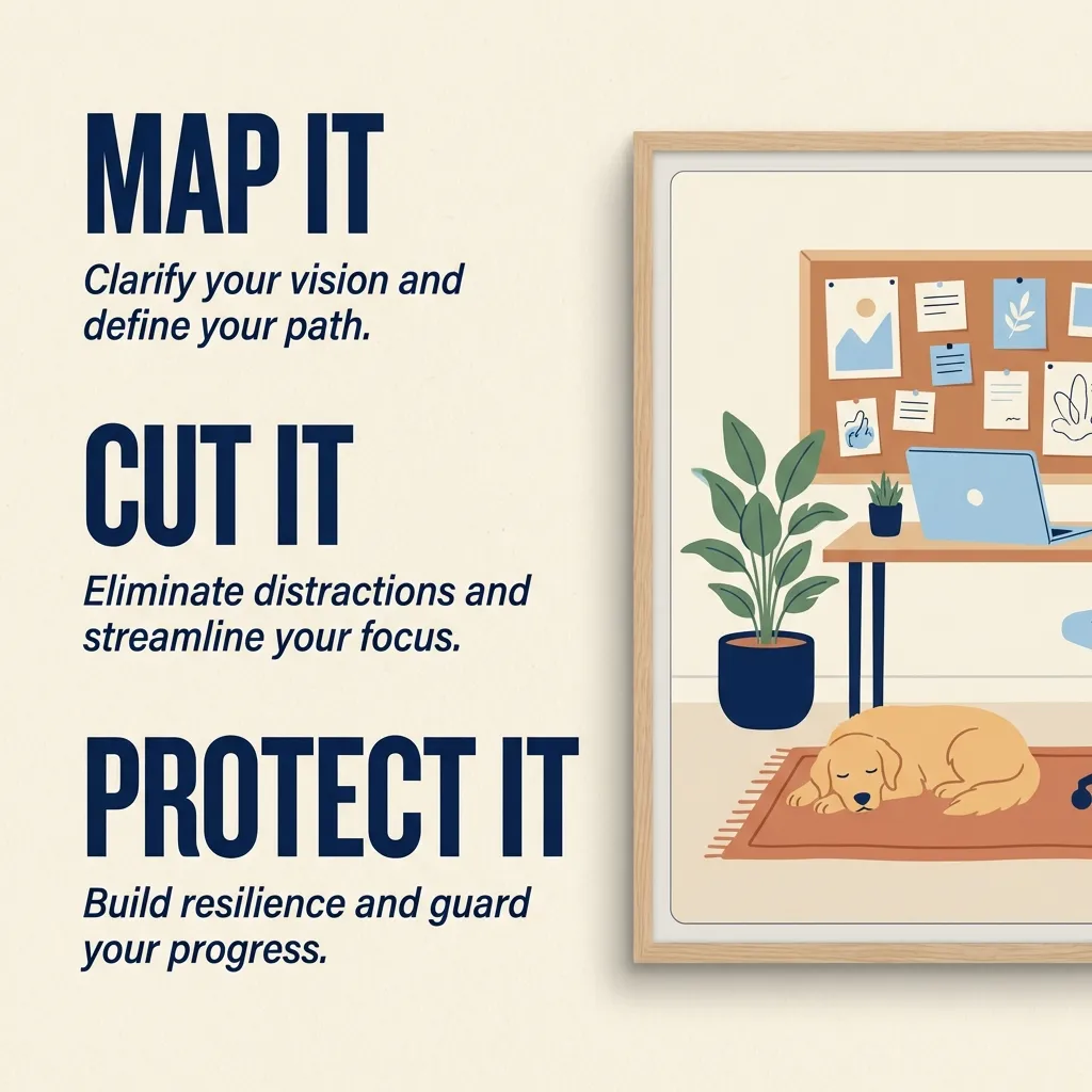
- 3-step process section (Map it, Cut it, Protect it)
- Lead gen section for free guide download
- Quiz intake form for qualified lead capture
Why This Works
- Scroll-driven animations create engagement without feeling busy
- Paper textures and hand-drawn elements feel warm and approachable
- Pinned sections give each message dedicated attention
- The calm aesthetic matches the brand promise of less hustle, more margin
Process
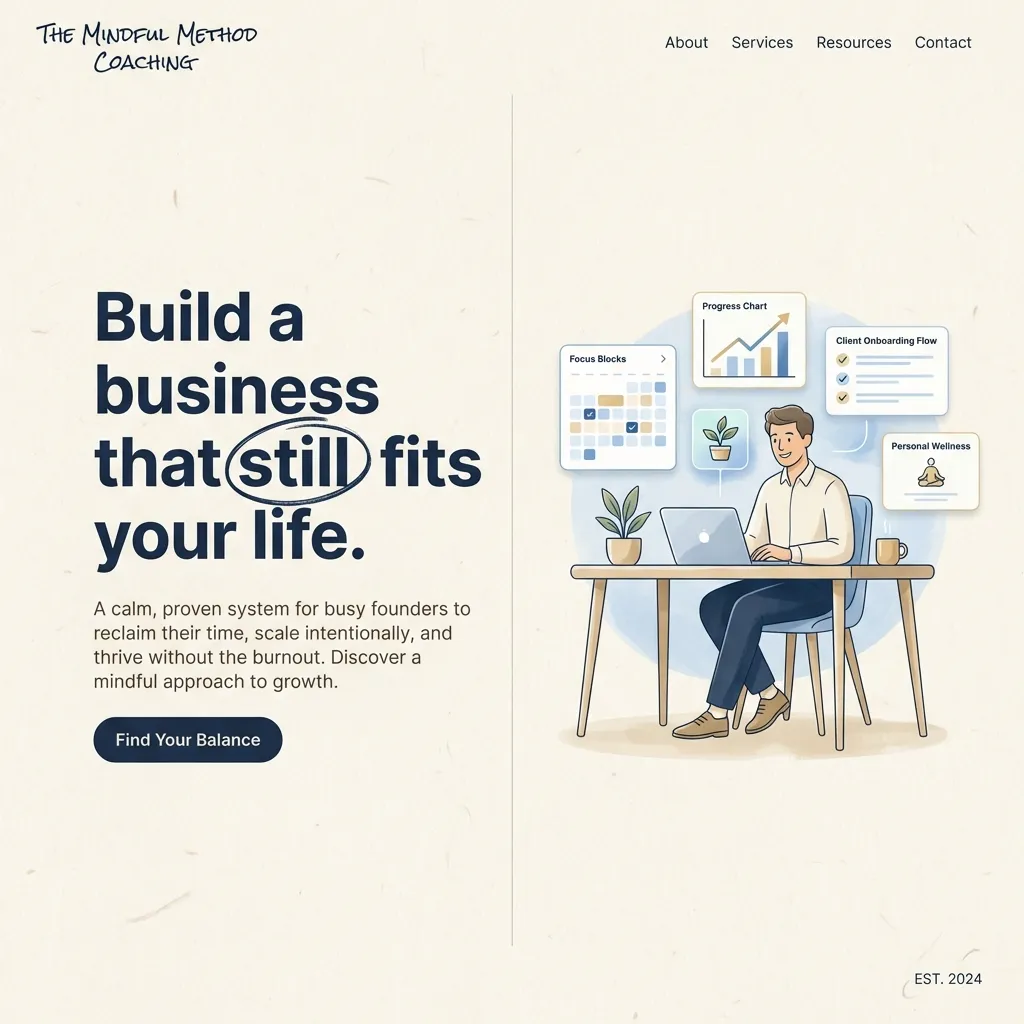
Editorial Hero Experience
Auto-play entrance animations and a friendly workspace illustration immediately establish the calm, intentional brand tone.
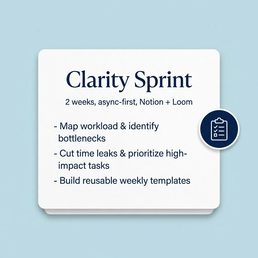
Signature Offer Card
The 'Clarity Sprint' product is presented as a tactile sticky note with rounded corners, soft shadows, and a navy accent circle—feeling like something you'd want to pick up.
Process Visualization
The 3-step system (Map it, Cut it, Protect it) uses large typography and a friendly illustration to make the method feel simple and repeatable.
Results & Impact
Scroll-Driven
Animation Style
GSAP pinned sections with 3-phase motion
7
Sections
Each with unique entrance/settle/exit choreography
Editorial
Design Feel
Tactile paper textures and hand-drawn accents
Need a website that feels different?
I build scroll-driven, motion-rich websites that create unique experiences—perfect for brands that want to stand out from cookie-cutter templates.
Send a message